|
Already the Stanley Cup Playoffs have been full of action with series being tied from two games or some teams play tonight to do just that. We saw Sidney Crosby score yesterday after having a great season and then Connor McDavid scored his first playoff goal after having a better season (or at least that's what I think... I mean... 100 points...). With all the goals being scored, do you ever wonder how many your team has had so far compared to the number they allowed? Today's statistics are all about this concept using a scatterplot and describing the distribution.  Playoff legend in the making? (@nhl) Data: This was collected from all the games so far and will become invalid very quickly today but it is useful for today's games. 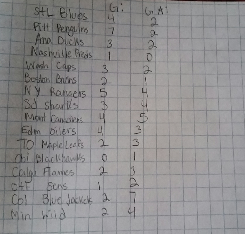 Courtesy of hockey-reference.com Plotting the Points: For this, I thought that the amount of goals scored should be the x-axis because we are trying to study that compared to goals allowed, which will be the y-axis. The y-axis serves to explain the changes made by the goals scored by the team. 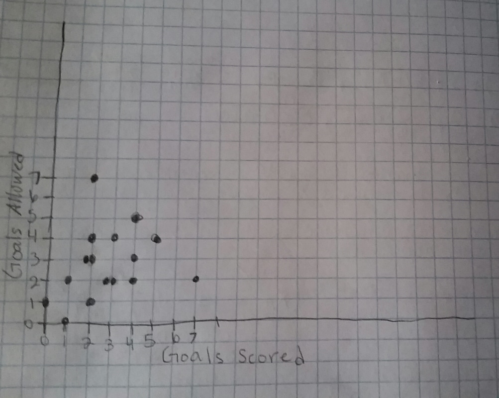 Interesting shape. Association: Positive- slope is increasing. Form: Linear- the pattern of the plot can be described with a line. Strength: Strong to Moderate- the points are close together and not scattered all over, but there are some stragglers. I wonder how much this will change after the first round ends. Pittsburgh is already off to a hot start and I feel for Columbus right now. I would like to see them have less negative goal differentials and win a game or two at home.
I hope that today will be a great day for hockey and we will see some cool things going on. That's all for today and we will be back next week! Leave a Reply. |
AuthorHi, I'm Jenna and I'm a sports fan! I've been avidly watching sports since 2011 because I found that by watching sports, I would be able to communicate with my dad and brother better. Ever since I got into sports, I've been able to enjoy myself more when I go to sporting events with my family. Archives
December 2017
Categories
All
|
 RSS Feed
